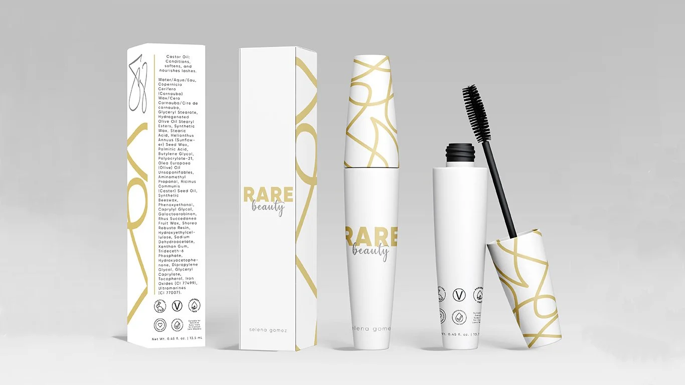
Rare Beauty Package
Re-Design
Rare beauty is a beauty copmany owned by Selena Gomez. The mission of the company is to not follow the high beauty standards that are going on. Rare beauty focuses in on being you’re natural self and to be who you are. For my package re-design I wanted to create something that was simple, but elegant to represent what the company stands for.
The Problem
With Rare Beauty becoming an up and coming beauty brand, I wanted to focus in on making the packaging of their mascara pop. The image shown is the current design of their mascara. Though it is very simple and beautiful, I wanted to see if I can redesign something that catches ones eye while shopping in a store or online.
Research
Target Audience
The typical audience for the brand consistent of millennials who are trendy and love to use makeup, and are middle-class.
Brand Personality
The brand follows a very strict persona which entails being who you are and showing your natural self. Rare Beauty also is very inclusive and simplistic.
Price Range
The typical price for their products range from $16-$29.
Competitors and Packaging
Some competitors include:
Fenty Beauty
Glossier
Anastasia Beverly Hills
Benefit Cosmetics
Glam Glow
Kat Von D
Tarte
Tatcha
What will make Rare Beauty stand out is their mission and packaging.
The packaging of the new mascara bottles would consist of eco-friendly material, recyclable packaging, and bio-degradable. It will also include matte finish and metallic-raised elements. The brand will make it known that they do not test their products on animals and they are vegan products.
Color Swatches
With the design I wanted to include something that was bright and happy. With the owner, Selena Gomez, being a lovely person I wanted to incorporate that within the colors. Also, after doing some research I found out her favorite color was green and tried incorporating that in the comps.
Typography
To keep the brand consistent, I included a typeface that was simple and also very elegant to consist of the original package design. I decided to use the fonts Century Gothic Pro and Hello.
Sketches
I decided to approach my comps in 3 different ways with similar features. I knew I wanted to include some line work that would be raised which will be useful when users are applying the mascara. I also played with the logo placement and different colors to see how they would go with the product vibe.
Compositions
For my first composition, the green one, I was trying to incorporate the owner, Selena Gomez, favorite color. Once I played around with it, I realized that the colors were not working out how I wanted them to. I then went to the white and gold design. I like the lines, but did not think it would stand out. I decided to work with it a little more and finally got to my final product.


